

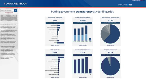
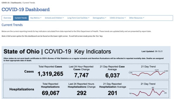
Public-facing dashboards provide transparency and accessibility, build connection and trust within communities, and empower leaders and residents to make data-backed decisions. In the past year our communities have faced the COVID -19 pandemic head-on. It’s no surprise that this led to a rise in dashboard use among state and local governments as well as the public. From tracking coronavirus cases to tracking vaccination rates, many government organizations know the benefit of visualizing data and then making that visual available to the public.
Not all dashboards are created equal. Below are three best practices to ensure accessibility and visual harmony when creating public-facing dashboards.
Making Data Accessible for All
Transparency and accessibility are key outcomes to public-facing dashboards. It’s important to ensure your dashboards are accessible to all. Create dashboards that conform to the Web Content Accessibility Guidelines (WCAG 2.0 AA). Incorporating features like captions and legends can help screen readers capture information. Design choices should be made to make visualizations appealing and easy to digest for all audiences. Items such as color choice should include consideration about those who experience color blindness. For users who only use a keyboard, edit the tab order of your dashboard to create a logical flow to how your data is viewed.
Considering How Users Will Interact
In 2019, mobile devices made up more than half of worldwide internet traffic. In the U.S., 25% of adults do not own a laptop or desktop computer, while an overwhelming 97% own cell phones. Knowing that the majority of Americans are accessing the internet through their mobile device, build dashboards that render properly when viewed on the smaller screen sizes.
Desktop users view data as they would read a book, from left to right, then top to down. Mobile users scroll from top to bottom. Typically, you want public-facing dashboards to scroll from top to bottom when viewed on mobile. When viewed on a desktop, scrolling is not best practice, instead you want to fit the entire visualization in one view.
Embedding for Success
A major benefit to software such as Tableau is the capability of easily embedding dashboards into websites. Embedding allows government organizations to display data visualizations alongside other related information all on one page. Before you embed, it's important to consider all the content on the website. The dashboard should complement the information on the entire page so it does not look like it was haphazardly added.
Public-facing dashboards are key-way governments can remain transparent, efficient, and connect to residents. The Covid-19 pandemic highlighted the need for the accessibility of real-time information for all citizens from a wide range of backgrounds. Being purposeful with design choices not only help the overall look and feel of a dashboard but impact who can access it.
Nego Jovanovich is a solution architect in Avaap’s business intelligence and analytics practice. Nego’s is an experienced leader and has partnered with organizations in the higher education, government, healthcare, and retail sectors to turn data into actionable information. Nego is passionate about data literacy and serves as an analytics lecturer at The Ohio State University.